The Project
An interesting set-up from a family-run business operating two distinctly different homes from one beautiful 30-acre estate in rural Surrey. The homes had operated under a traditional, dated brand and now needed to update this to showcase the superb and often pioneering work that was done in moving dementia care forward.
ClientHuntington & LanghamCareResidential, Nursing, Dementia CareURLhuntingtonlangham.estate
The Method
The two homes had always had separate names and CQC registrations, but the reality was that being run by one family meant there was plenty of crossover in the way care was delivered on both sites, and how the teams were looked after and the residents cared for. Our concept was to unite the two homes under one brand which demonstrated this, and from Huntington House and Langham House, we created the Huntington & Langham estate.
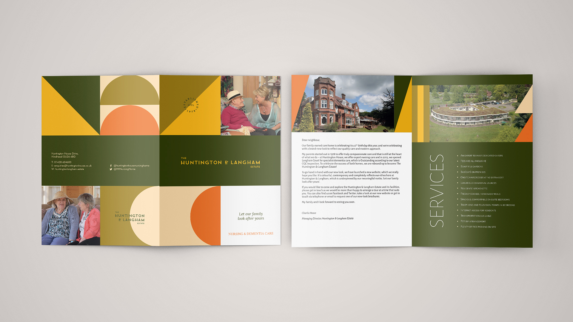
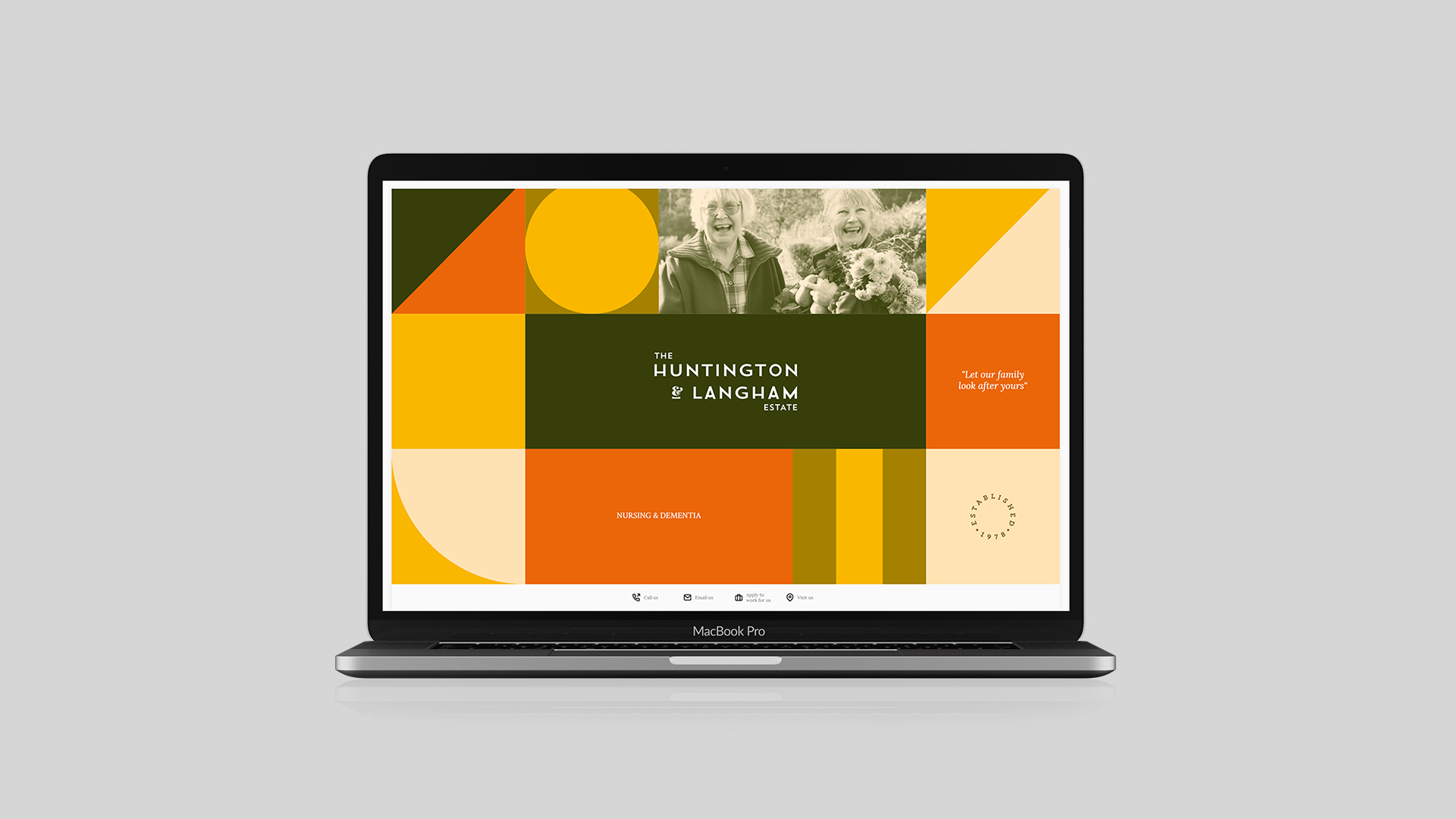
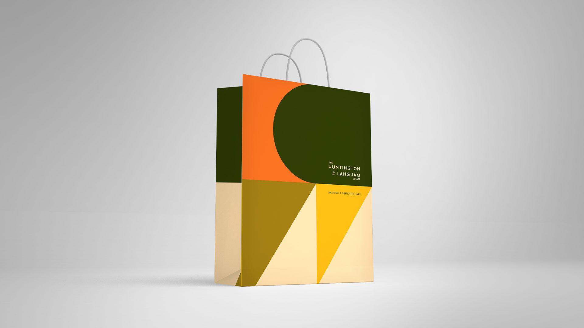
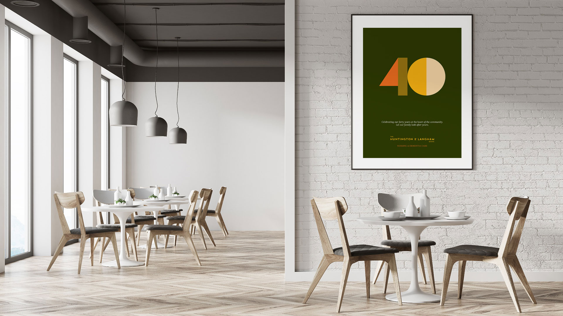
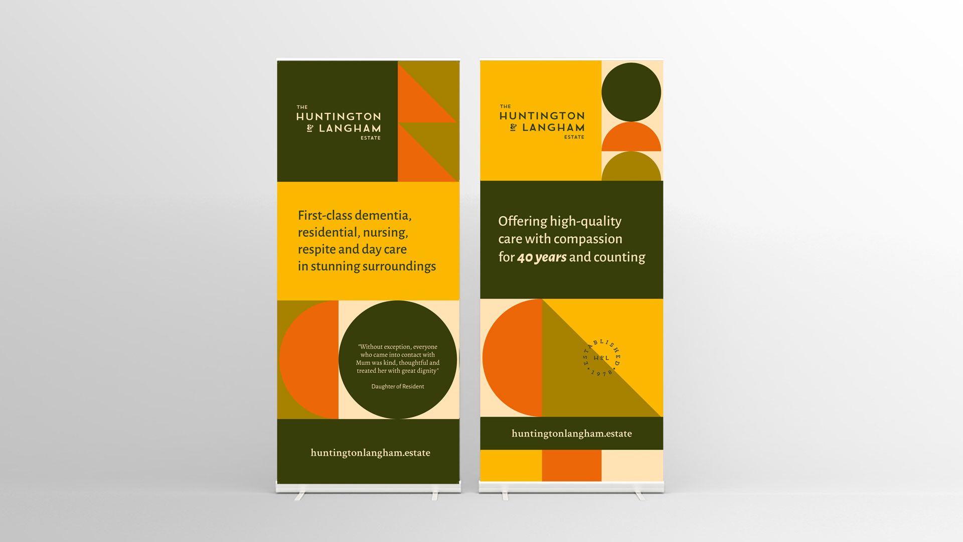
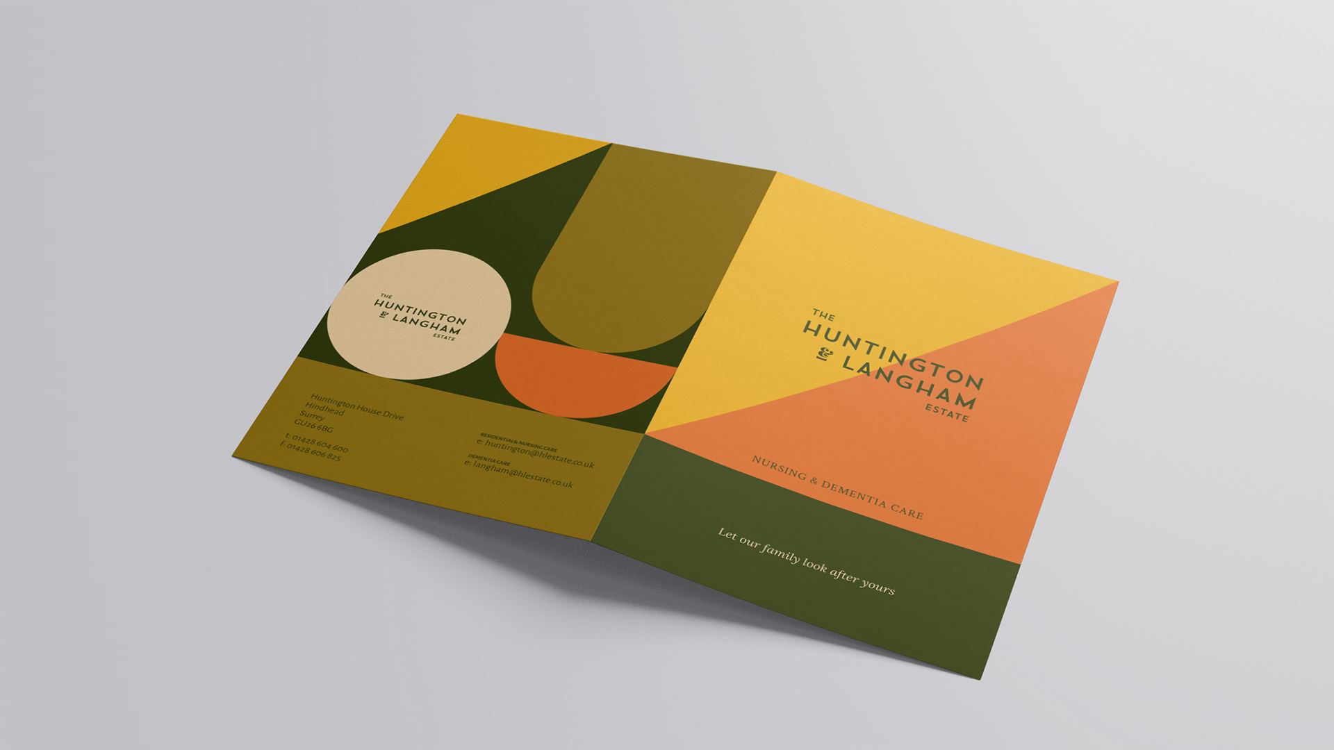
The client liked early 20th century inspired designs and the estate itself provided inspiration for the colour palette. Our solution was a Bauhaus inspired geometric pattern, coupled with the rich, nature colours from around the estate at various times of the year. This was then complemented by a modern typeface which referenced the metropolitan fonts of the 1920s and 1930s.
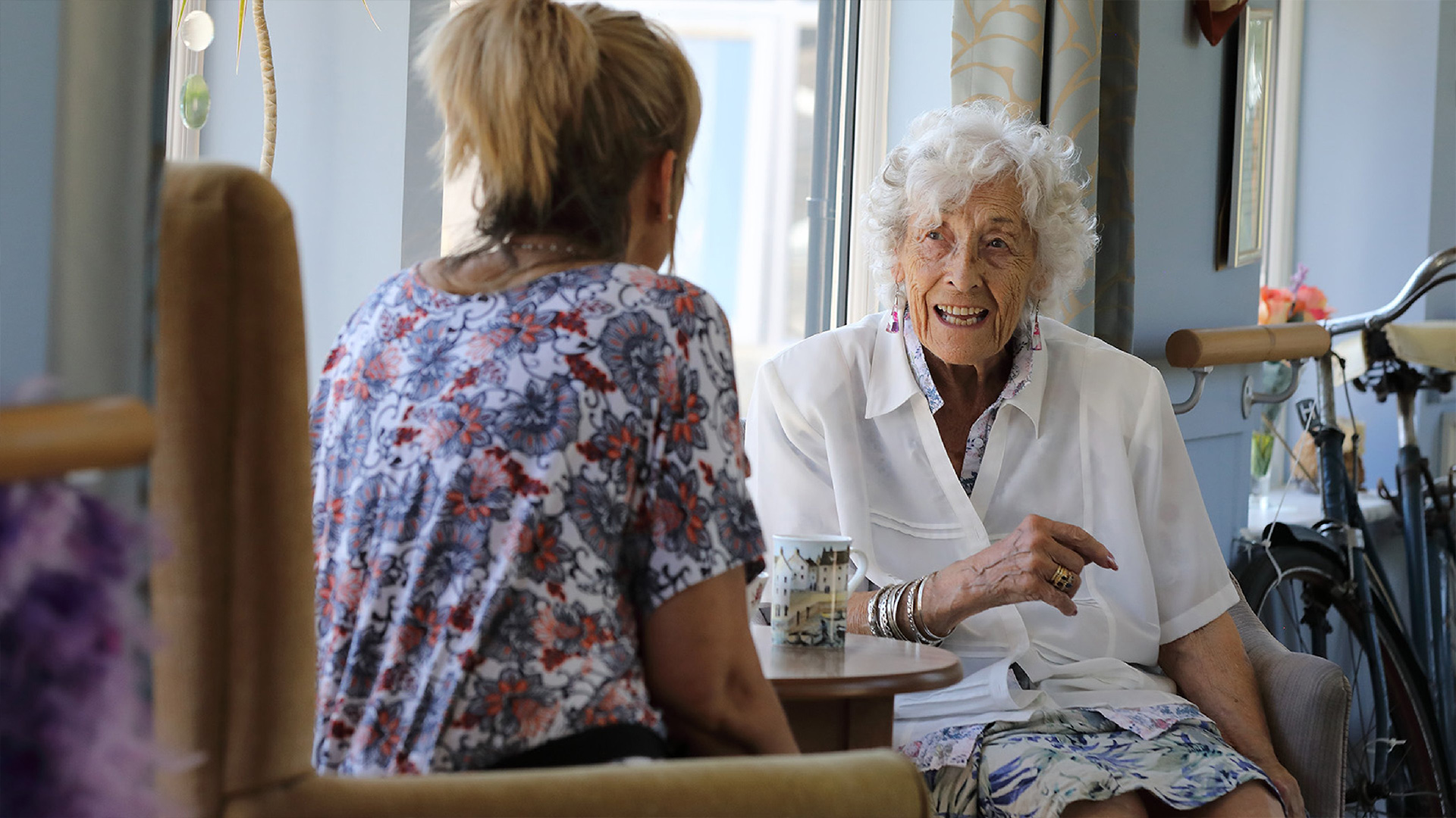
The brand was applied to all the materials the home used, photoshoots and drone runs were captured and the website created to showcase the homes and the family that runs them.
The Results
The brand now shows both homes together meaning that effective joint marketing is easier, more effective and ultimately less expensive that marketing two homes separately. The brand has been universally adopted and features in every corner of the business, from the signage to the vehicles on site.

